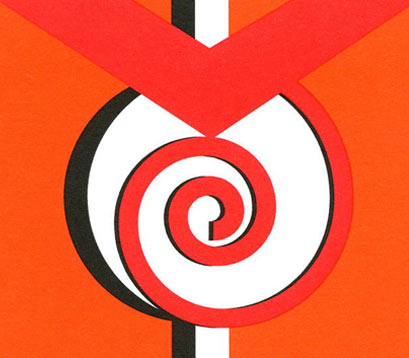
Can you find the “M” and the “O” inside the orange and black symbol above? How about a spiral shape engulfed inside the larger circle?
This game of hide and seek mirrors how I operate in the world of storytelling.
In this logo—as in my life—I hunt meaning.
Mélange became the name of my writing business for a simple reason. Easy to remember, it differs from my first name by only a single letter. Properly spoken, the word rolls with a soft foreign touch, appealing to my rebel nature. I adore that apostrophe, too.
I liked the word so much, my blog earned the same name.
With its double usage, this French word mirrors my logo, an authentic stand-in for how and what I write. Mélange means mixture, assortment, variety. How perfect a representation for a multi-genre writer who also practices multiple art forms (collage, watercolor, and shoe painting).
The Mélange logo echoes this theme of double. There’s two website uses (business and blog names), two colors (orange and black), two names (Melanie and Ormand), two letters (“M” and “O”), two ovals (spiral and womb), and two shapes (square and circle).
The number two carries power. It unifies, strengthens, couples, bonds, and comforts. Loneliness vanishes when two abounds.
For a bit of levity, consider this amidst my craving for meaning: I have come full circle.
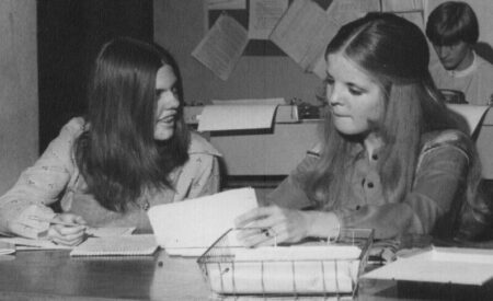
As a high school senior, I edited my school newspaper and wrote a weekly column. Its title? Mélange.

Fascinating how senior writing in high school would morph, nearly a half-century later, into a senior writing business.
As I observed and commented to classmates then, I see and write for readers today.
Yet another double dip in the circle that is my life.
Meaning rules, with a synchronicity bonus.